Logo design and branding
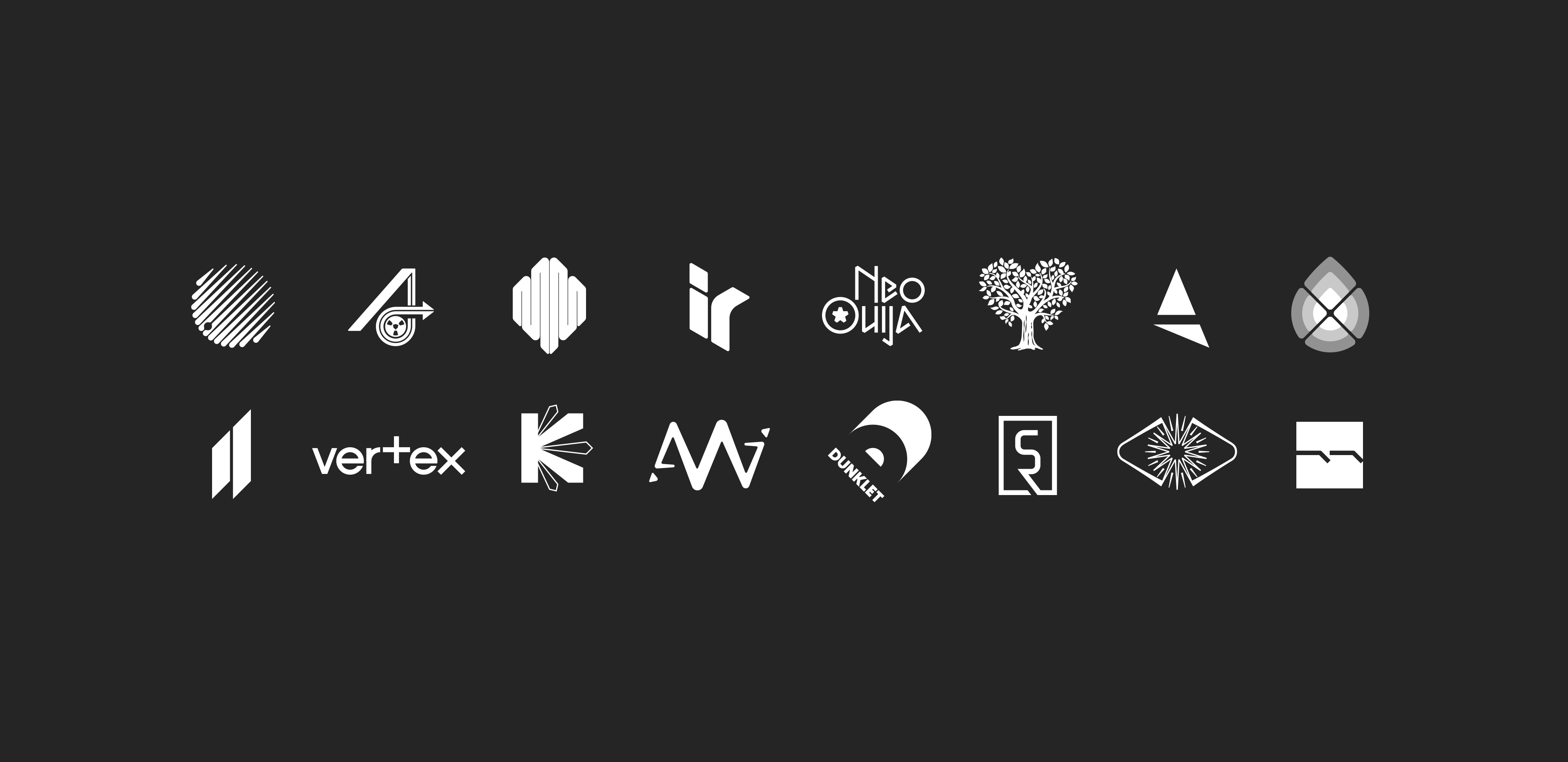
A selection of logos and identities I have designed for clients.
Most of my logos for musicians and record labels are designed to work as strong standalone graphics. They have to be adaptable, recognisable at any size, work in any colour, on any background, and have presence when positioned with other logos. The business logos shown here form the heart of a brand identity, working in harmony with colour palette, typefaces and other visual elements.
Whatever the job, I always aim to craft something distinctive, characterful and relevant.
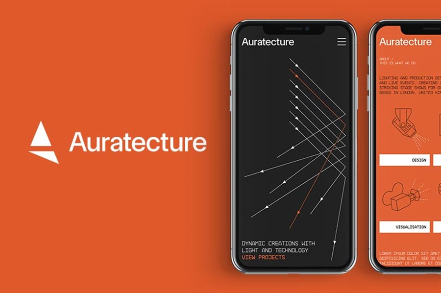
A spotlight casting a shadow creates the A in this logo for Auratecture — a company specialising in stage concepts and lighting for concerts, tours and live events — see the project page.
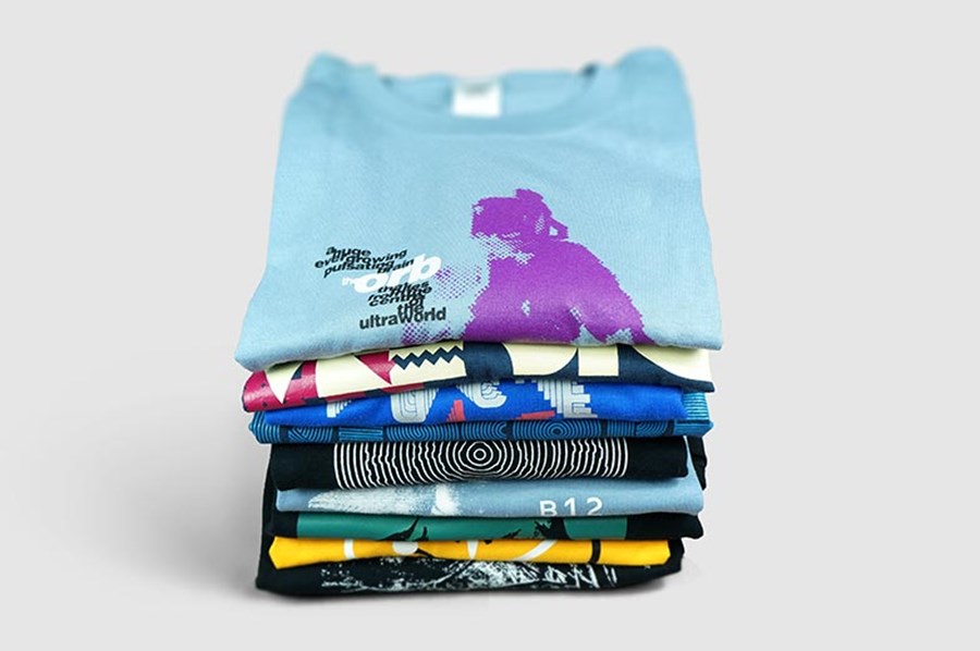
Heart-shaped tree logo for the 2024 Vogrie Pogrie festival was a complete reworking and refinement of the existing branding. I also designed posters, a site map and t-shirt. Thanks to Paul at Peril Design for the project.
Rollits were a UK based law firm I worked with from 2008—2022. See the project page for the complete branding.
Arrows burst out in different directions, showing energy and choice of career path in this logo for a website promoting careers in the Kent tourism and hospitality industry.
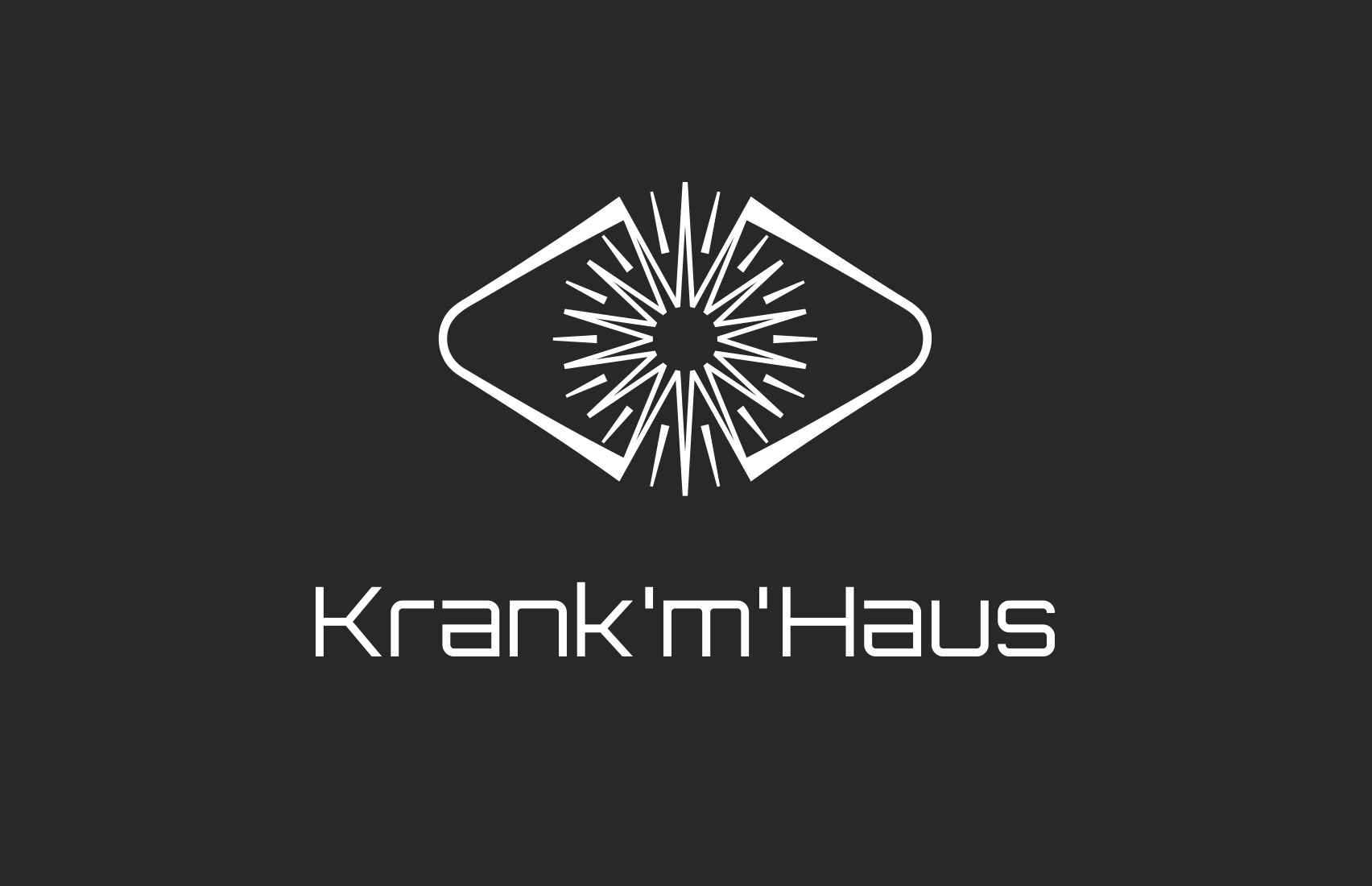
Stylised eye with a burst of energy as the iris for Belgium record label Krank'm'Haus. Their brief to me talked of electronic music being about imagining abstract and surreal things during a listening experience whilst feeling the atmospheres and emotions of the music. They describe the label as "like a doorway into a new world". Eyes are a symbolic sensory organ and are associated with intelligence, light, conscience and truth.
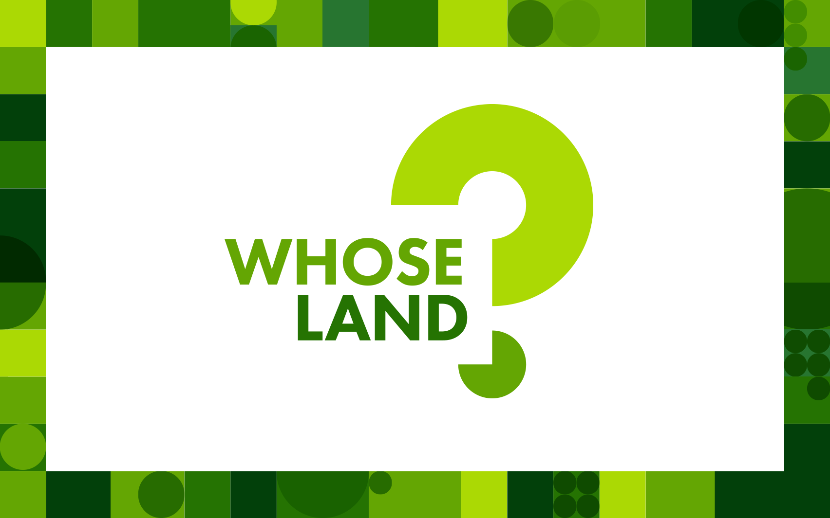
Logo and title card design for the webinar series: Whose Land? Inclusive Pathways to Land Governance for Land Portal. Cut off circles form a question mark made from shapes inspired by pie charts to show how land is divided up (as well as missing land information in the negative space). Project was completed for Convincible.
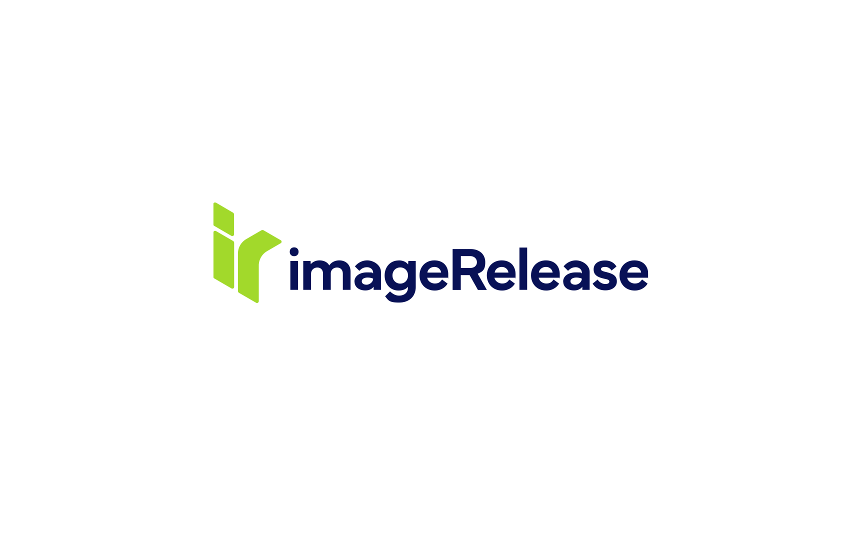
Logo and branding for imageRelease, a company that makes it easy to manage (and obtain) model, artwork and image releases. The client wanted a simple, abstract "ir" workmark, I came up with this 3D mark to represent a new angle on model release. I also came up with the "Our mission is permission" strapline.
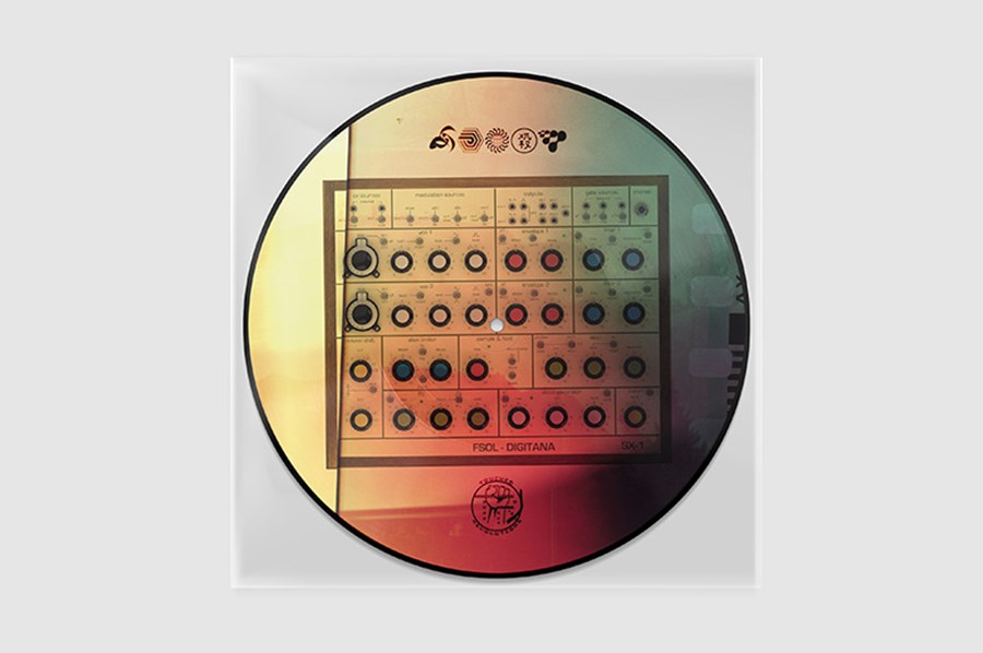
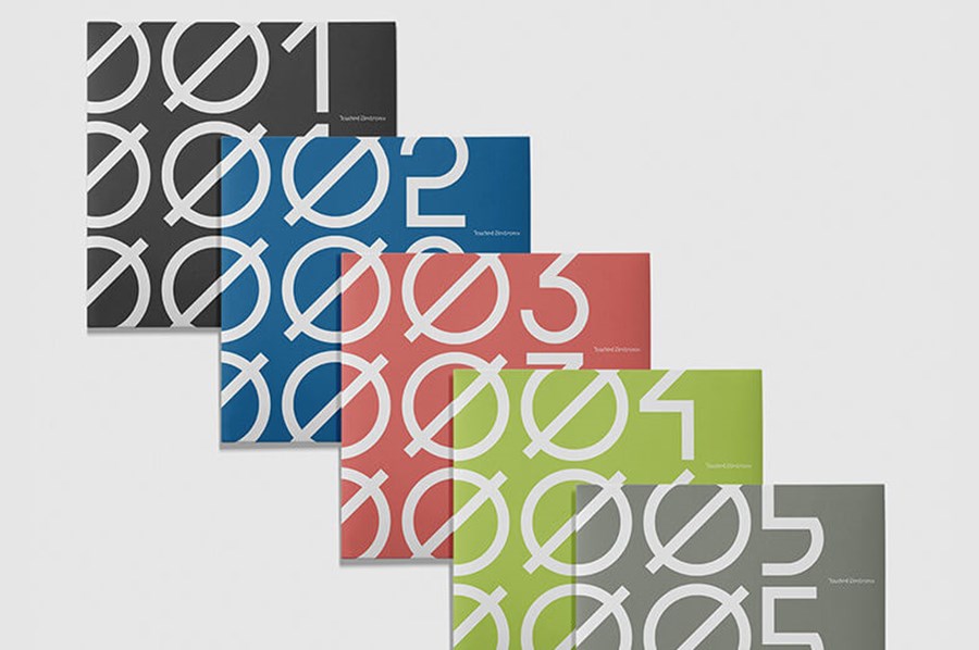
Touched Electronix was a joint record label by Touched Music and Furthur Electronix. See the project page for the whole identity, including custom font and album artwork.
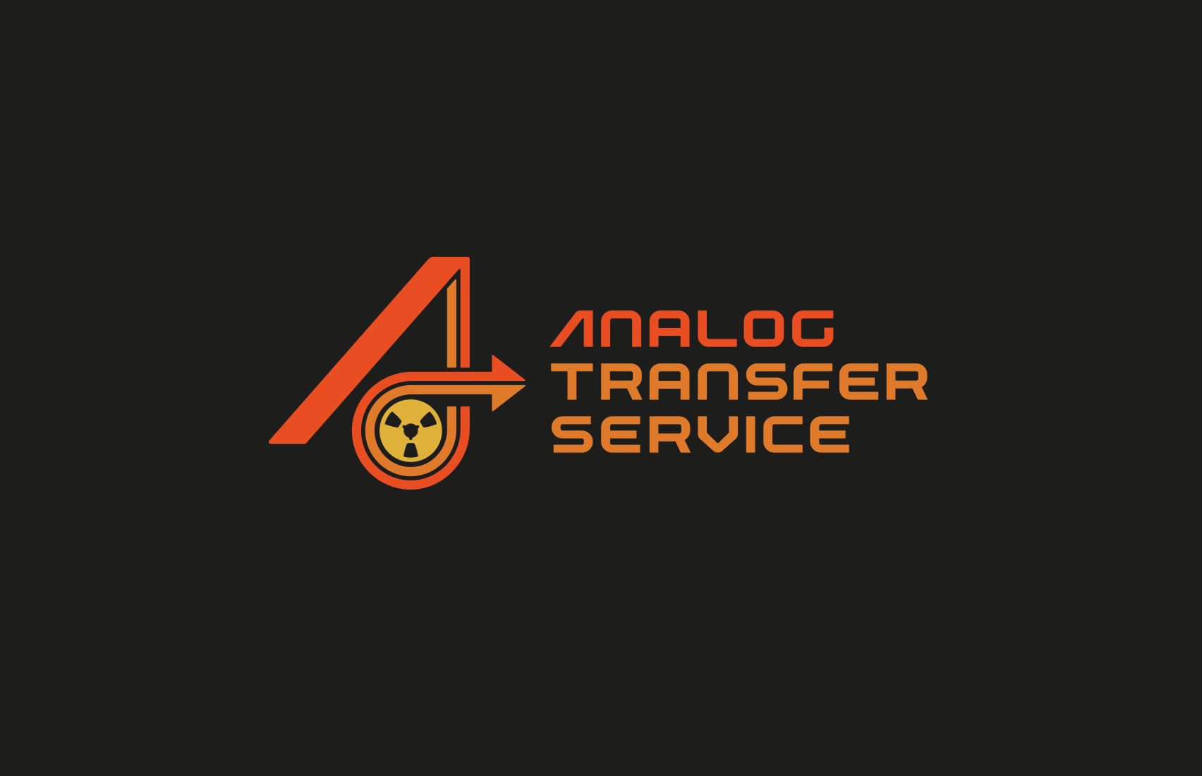
A NAB tape reel features in this 70s/80s inspired logo for musician Analog Transfer Service who records on open-faced (reel-to-reel) tape
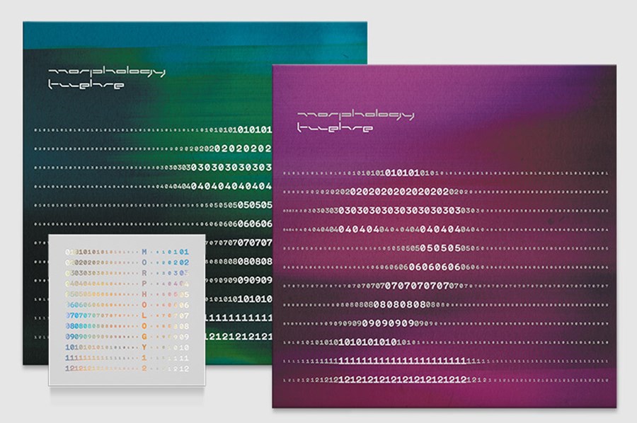
Custom wordmark and icon for Finnish electro duo Morphology, I got to use the logo on the Twelve album artwork for FireScope Records.
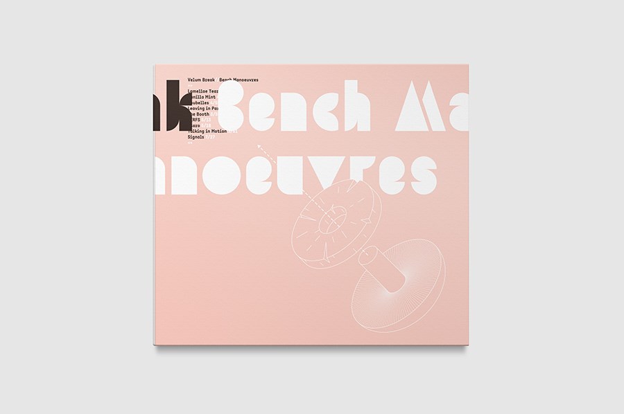
Abstract wordmark for electronic music label Dyadik. Each letter of the wordmark is made from two shapes (Dyadic means something that consists of two parts or elements). See how the concept works along with the branding, including custom font and album artwork, on the project page.
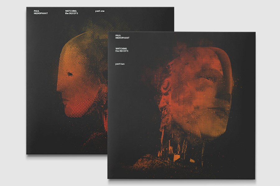
A moon casting a shadow on an alien planet for electro label Hierophant Records
Wordmark for musician Steven Rutter (half of pioneering early 90's UK intelligent techno/electronica act B12).
The plus becomes a "t" in this wordmark for Vertex Recordings, a joint record label from Verdant Recordings and Exalt Records (ver + ex = vertex).
A briefly used bespoke typographic wordmark for Neo Ouija, a long running record label specialising in electronic music, I think it only appeared on one release :(
A vinyl record makes a negative space D for a club night (Dunklet means darkness/gloom/obscure in Swedish).
Ambigram logo for dancer – Ami.
A startup specialising in email marketing.
A stylised flame for this utilities company identity.